Riffle: an Apple Smart Stack for the inside of your app
Every app collects a little pile of things it wants to tell you. Upgrade to Pro. Rate us. Here is a tip. There is a new feature. Left unmanaged, each of these becomes its own banner, sheet or badge, and together they turn the interface into a nag. People learn to swat them away without reading, which is the worst of both worlds: the app feels pushy and the message still does not land.
I kept running into this in my own apps, so I built Riffle.
The idea
Apple already solved a version of this on the Home Screen. The Smart Stack is one widget slot that holds several widgets and shows the most relevant one, rotating as context changes. Riffle brings that pattern inside a SwiftUI app: one card slot that surfaces the highest-priority card, auto-rotates through the eligible ones, and lets people swipe to cycle through the deck, peeking cards and all.
The important word is deterministic. The Home Screen Smart Stack is driven by an opaque on-device model. Inside your own app you usually want the opposite: you want to know exactly which card shows and why. So in Riffle, visibility and order come from two explicit things you control, priority and eligibility, and nothing else.
What it is
Riffle is a pure SwiftUI package with zero external dependencies. It is written for Swift 6 with strict concurrency, and it runs on iOS 17, macOS 14, tvOS 17, watchOS 10 and visionOS 1. It ships under the MIT license and it is published on the Swift Package Index.
You add it the usual way, through Swift Package Manager:
.package(url: "https://github.com/kempsu/Riffle.git", from: "1.0.0")Priority and eligibility
Here is the core of it. You declare a stack of cards, give each one a priority, and gate it with a condition. Riffle filters out the cards whose condition is false, orders what is left by priority (highest first, with declaration order breaking ties), and shows the winner. If nothing is eligible, the stack renders nothing at all: zero size, no border, no empty state to design around.
import Riffle
import SwiftUI

struct PromosView: View {
    let entitlements: Entitlements
    let engagement: Engagement
    let review: ReviewState

    var body: some View {
        RiffleStack {
            RiffleCard(id: "pro") {
                ProUpsellView()
            }
            .priority(.high)
            .shown(when: !entitlements.isPro)

            RiffleCard(id: "rate") {
                RateAppView()
            }
            .shown(when: engagement.daysActive >= 7 && !review.hasRated)

            RiffleCard(id: "tip-gestures") {
                TipView(text: "Swipe down to switch cards")
            }
        }
        .riffleAutoAdvance(.seconds(6))
        .riffleIndicator(.bars)
        .frame(height: 120)
    }
}
A paying customer never sees the upsell. The rating card only appears after a week of use, and only if they have not rated yet. The tip is always eligible but sits at normal priority, so it fills the slot on the days nothing more important is competing for it. You can read the whole policy straight off the screen, which is exactly the point.
Priorities are just integers, so you can add your own tiers:
extension RifflePriority {
    static let critical = RifflePriority(rawValue: 1500)
}
Cards you write, or cards you get for free
For the common cases (an upsell, a prompt, a tip) there is a built-in layout, RiffleStandardCard. You give it a title, a message, an SF Symbol, a background, an optional accessory glyph, and handlers for tap and dismiss:
RiffleCard(id: "pro",
           title: "Upgrade to Pro",
           message: "Unlock everything.",
           systemImage: "sparkles",
           background: .gradient(light: [.pink, .orange], dark: [.purple, .indigo]),
           accessory: .chevron,
           action: { showPaywall() },
           onDismiss: { hasRated = true })
When the built-in card is not enough, you drop any SwiftUI view into a RiffleCard and it becomes part of the deck. The only rules are the sensible ones: fill the frame, clip your own corners, and give yourself an opaque background so the shadow lands correctly.
Movement, without the motion sickness
Rotation is opt-in. Set riffleAutoAdvance(.seconds(6)) and the slot cycles through eligible cards on that interval; leave it .off and the slot stays put until someone swipes. Auto-advance pauses while a card is being touched and for one interval afterward, and it stops entirely when the scene is inactive or the stack scrolls off screen, so it is not spending cycles or attention in the background.
The rest is configurable without ceremony: the transition style (flip, slide, push, fade, scale, or your own), the page indicator (dots, bars, or custom), and how deep the cards behind the front one peek.
Accessibility was not an afterthought
This is the part I am most happy with. The stack is a single adjustable element for VoiceOver: people swipe up and down to move through it, and it announces “Card X of Y” as they go. When Reduce Motion is on, every transition degrades to a plain cross-fade. Built-in indicators respect Dynamic Type. None of this is a setting you have to hunt for, it is the default behaviour.
Try it
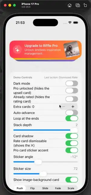
The package, a runnable demo with live control panels, and the full DocC documentation are all on GitHub. If you have a SwiftUI app with more than one thing to say, I would love for you to try it and tell me where it falls short.
- Source and demo: github.com/kempsu/Riffle
- Documentation: kempsu.github.io/Riffle
There is a roadmap as well: a data-driven stack that takes a collection, frequency capping and snooze so a dismissed card stays gone for a while, lifecycle callbacks, and eventually some real relevance signals (recency, last-shown time) to make the rotation genuinely smart. For version one, though, I wanted the boring, predictable core to be right first. Predictable is a feature.